Few things in marketing can drive straight to the bottom line of your business like a well-converting website. Your website could be the difference between a struggling startup and a thriving trend-leader.
We frequently discuss the impact that your website can have on your business, but less frequently dive into the details of how the user experience and other various website design elements can impact it. So, what makes a good business website?
In this post, we will explore one of the common web design elements that convert well, branding, and how you can use your branding more effectively on your website. If at any point you feel you need help from an experienced branding agency in Houston, feel free to contact the team here at MARION.
Appropriate use of branding elements on your website
It’s hard to overstate the importance of good branding for your marketing efforts. We talk about it frequently with our clients, but it’s often an after-thought for most website designs or refreshes.
The bottom line is this; there are few elements of website design that can have as large of an impact on your conversions as branding can. So, how should you use branding appropriately on your website?
First, let’s discuss what branding is not:
- Branding is not just your logo. Yes, your logo is a piece of your brand, and an important one, but when we say branding, we don’t mean just your logo.
- Branding is not just your design aesthetic. Yes, your design aesthetic is a piece of how you position and present your brand, but it is not your brand.
- Branding is not what your company does. Yes, what you do is a part of your brand, but the bottom line is that your brand is what people feel about your company.
Whether the use of branding on your website is effective or ineffective can be answered in a single question. “Are your website visitor’s feelings towards your company aligned with the feelings that you want them to have?”
In essence, developing a brand is storytelling. Is your website telling the right story or are you unwittingly reinforcing the wrong feelings about your company?
If you effectively and appropriately leverage your branding on your website, you can expect to see:
- Increased credibility. Your website visitors have to make a judgment regarding your credibility, your reliability, your experience, your size, and a whole host of other qualifiers. Excellent branding removes hurdles, objections, and concerns from your conversion process.
- Increased visibility. Strong branding works to build credibility within your target audience, but it also helps establish you as an industry leader.
- Increased conversions. When you proactively address concerns and establish yourself as an industry leader with both your target audience and your peers, you grease the skids on your sales funnel and improve the conversion rate at each step along the way.
So, how do you properly leverage your branding on your website?
3 Critical Elements of Web Design Branding
It’s good to understand the effects of web branding whether you create and manage your website yourself, or you’ve learned how to find a website designer that can implement branding elements for you. Here are three key steps to get you started:
1. Web design logo placement
Your logo belongs on the left-hand side of the header section of your website, period. You may be toying with the idea of a center aligned logo on your new state of the art website, or god-forbid a right aligned logo, but you shouldn’t.
There are things that we have grown to expect when interacting with technologies. We expect that if we want to close an application, there will be an “x” in the top right corner. We expect that if an element is clickable, it should look like it is a clickable element. According to the basic logo rules of placement, we expect to find a logo in the top left corner of a website.
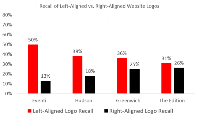
The Neilson Norman Group found that users are 89% more likely to remember logos shown in the traditional top-left position than logos placed on the right.
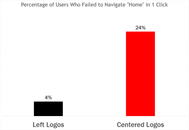
Additionally, another study found that getting back to the homepage is about 6 times harder when the logo is placed in the center of a page compared to when it’s in the top left corner.
Don’t try and break the mold on logo placement. If you want the most memorable and functional logo possible, keep it simple and keep it in the top left corner of your website.
2. Design aesthetic
When it comes to your website, you have a fantastic opportunity to let your brand flag fly. Be you, authentically you, and your website visitors will respond.
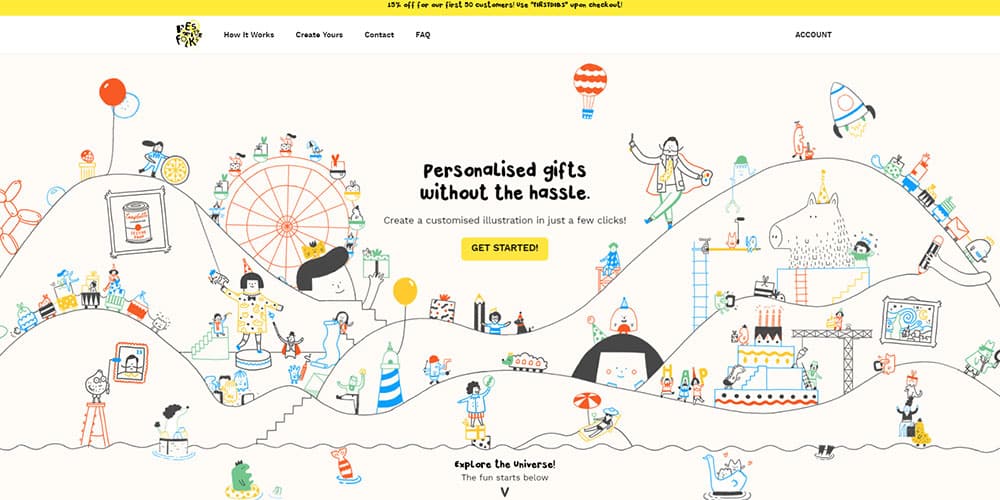
Take this website design for Festive Folks, the experience that the user is presented with is certainly unique to their brand.
Whenever a potential customer interacts with your brand they should be presented a single and consistent design aesthetic and, today, your website may be the number one touch point between you and your potential customers.
Having a design aesthetic does not mean, however, that you need to over-design your website. Sometimes using minimal design elements is more appropriate for your brand, and tells a more accurate story.
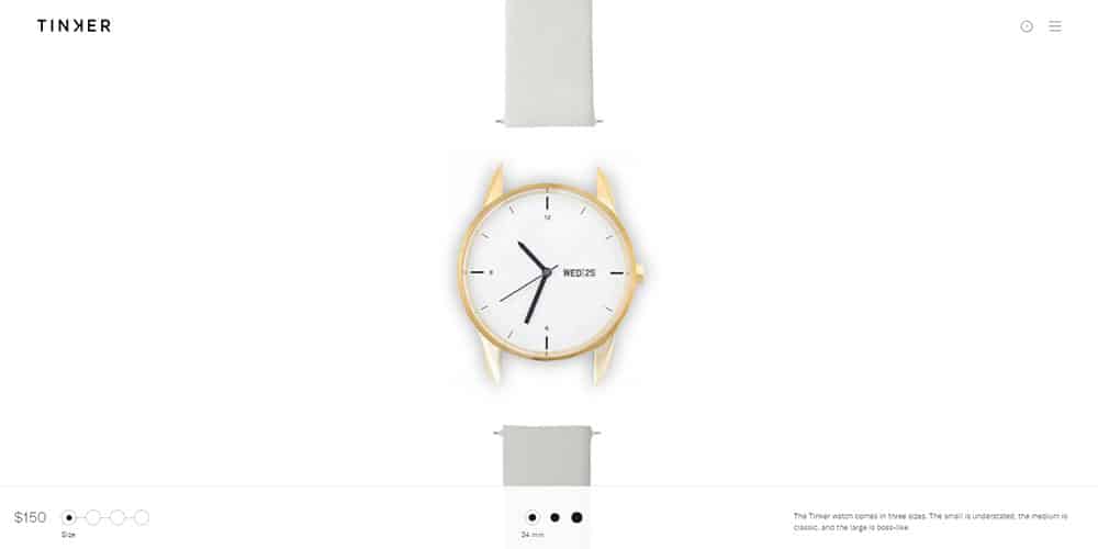
For examples, if you explore the Tinker Watches website, you will find they their use of website design elements, or lack thereof, to reinforce a sense of simple elegance.
A simple website that is thoughtfully designed and executed will feel more sophisticated than a website with all the bells and whistles that is thrown together without careful consideration for a desired aesthetic.
Consider your font choices. What does it say, albeit subconsciously, to your visitors that you’ve chosen that font? Would another font more appropriately convey your brand message while still being a legible choice for users?
Consider your imagery. Granted, we can’t all afford to shoot candid photos for every image we need on our website, but we can strive to use higher quality and stylistically appropriate stock images.
Most importantly, your website should be consistent with your other print collateral, like business cards and print pieces. All your marketing should be created with the same elements of good web design in mind and practice. For help from a pro branding agency in Austin, reach out to MARION today.
3. About us pages
Branding is storytelling, and you must devote the proper website real estate to directly delivering your story. Addressing deficiencies on your about us page may be the quickest and easiest way to more appropriately leverage your brand on your website.
Your about us page is an extremely effective way of giving your audience the facts that they need in order to draw the correct conclusions about your company; facts that they aren’t likely to get from any other source.
Have you been in business for 50 years? Put it on your about us page. Do you win tons of awards? Put it on your about us page. Do you have the best employees? Put them on your about us page. Do you have a driving principle that separates you from your competition? Well, put that everywhere, but especially on your about us page!
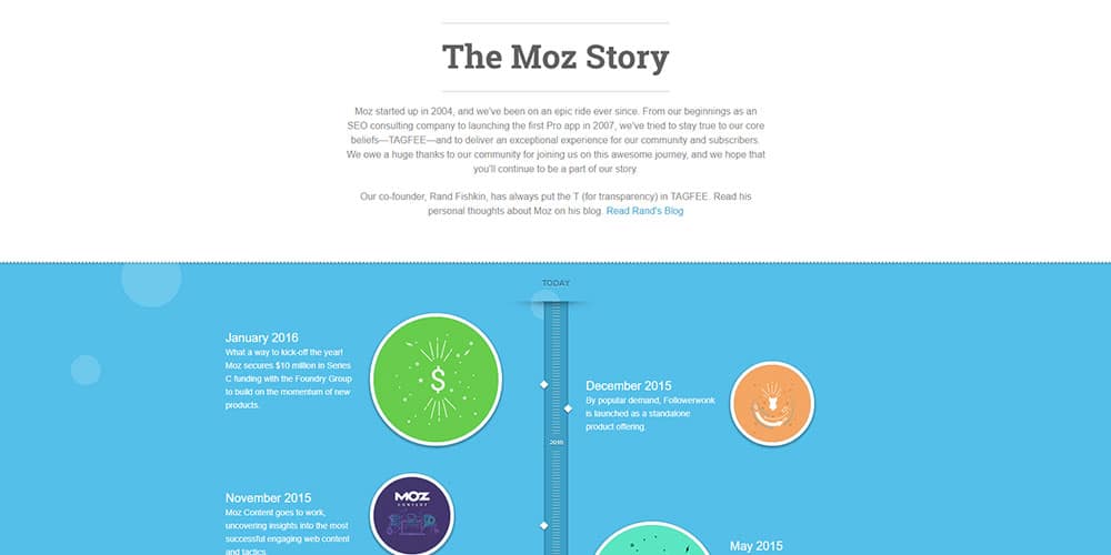
Around here, we love Moz; they’re an invaluable resource for agencies and internal marketing departments alike. They also happen to have a great about us page, though admittedly it’s a very literal interpretation of storytelling.
You don’t have to be so direct with your storytelling, just be aware that your visitors are forming a story in their minds and this is your chance to push your narrative.
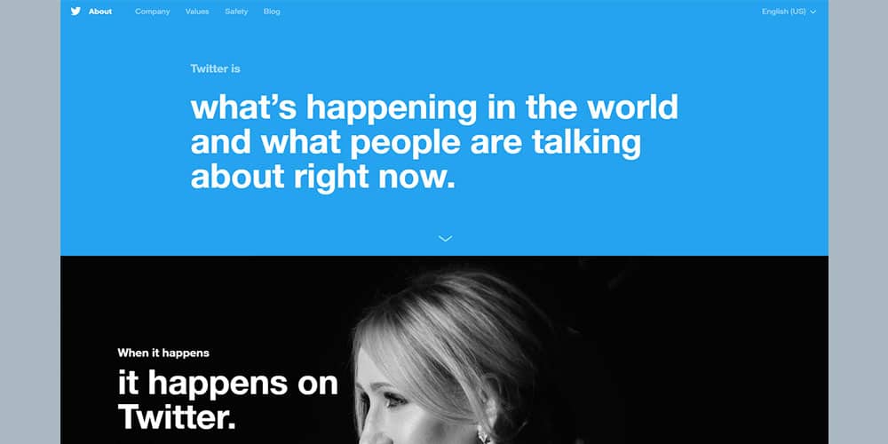
Twitter does a great job of using their about us page to both showcase their product and to paint a narrative of how they want you to see the world as interacting with their product.
If you focus on making your about us page a key page on your website and use it properly, you can see major improvements in the quality and/or quantity of leads that your website generates.
Don’t believe me? Log into your website analytics and compare the amount of traffic your about us page gets versus your services or product pages. I think you might be surprised. If you’d like professional help, web design firms in Austin like MARION have the experience needed to be successful!
The Take-Away
For most small to mid-sized companies, a well-converting website can make or break their business. One of the cornerstone design elements for websites is strong and appropriate branding.
If you lack the right expertise, don’t be afraid to leverage our web design services in Houston. To get your personalized quote, contact MARION today.
Unfortunately, small to mid-sized businesses often have an incomplete, poor, or frankly incorrect idea of what branding is and what it means for their company.
If you make the necessary investments – whether time, energy, or resources – into your brand, you will find that it will serve as a solid foundation for all of your marketing, including your website. The bottom line is, better branding equals better conversion metrics.


