Your logo holds a lot of meaning to you, and it should. It represents something that you’ve worked hard to build and cultivate. And the chances are that you put a fair amount of time, thought, and effort into creating the logo as well.
Not to mention the fact that designing a logo isn’t always the simplest or most enjoyable process. It can be one of the more artistic aspects of your business, and art is subjective. The nature of a logo design project can make it hard to come to a consensus among those involved.
Despite all of this, there will come a time when you need to update or refresh your logo. There are a lot of reasons why it may be time for a refresh, and we’ll look at these in more detail, but the bottom line is that it’s time for a refresh when your branding is no longer as effective as it could be.
Logo Refresh versus Rebranding
You may be thinking to yourself that refreshing your brand every so often defeats the purpose of all your brand awareness efforts. If this is the case, you’re probably thinking more of rebranding versus refreshing your brand. (Just make sure you avoid these common rebranding mistakes!)
A rebrand is usually representative of a much more drastic change than a refresh. It usually involves a new name, icon, design, or combination of the three being created to specifically develop a new and differentiated identity.
Here’s an example. Time Warner Cable had a notorious problem with its brand; it had become synonymous with terrible customer service. In May 2016, Charter bought Time Warner Cable, and within six months, Time Warner Cable ceased to exist, and Spectrum Cable was operating in its place. It is the same company, offering the same products only under a different name, and we can only hope with a revamped customer service approach.
When a company completely changes its brand identity, it’s rebranding. This shedding of a brand usually occurs when the upside of creating a new identity outweighs the loss of brand recognition. brand preference, and brand loyalty – which we often just refer to as brand equity. I think it’s fair to say that Time Warner Cable didn’t have much brand equity left with its customer base when it was rebranded to Spectrum, making it an understandable move.
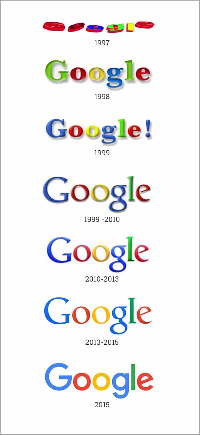
On the other hand, there are many times when it is appropriate to update your logo in a way that specifically retains its most identifiable features in an effort to stay relevant while trying to maintain as much brand equity as possible. In some cases, this can happen every few years, but for most, it is much less frequent. This refresh cycle is demonstrated well using the 20-year life span of Google’s logo:
How to know if it’s time for a logo refresh
There are any number of reasons that your logo may need to be refreshed because there are any number of reasons why your branding may be less effective than it should be. Here are some of the most common reasons:
Your logo looks old
While the average consumer may not look at your logo and think that the typography is dated, or that the glossy nature of your icon indicates that it was designed in the 90s-2000s, they probably can tell you that your logo feels old and out of touch.
Whether we like it or not, design is, in many ways, a cycle of trends, just like fashion. And just like trends in clothes, eyewear, or hairstyles, it doesn’t require expert training to identify outdated styles.
Here’s a great example of taking a dated logo and refreshing it, while effectively retaining its most recognizable features:
Your logo is busy/complicated
More than ever, your busy logo may be hurting your brand. Busy logos have existed since the dawn of logos. In fact, many of the first logos were complex line drawings. In the digital era, complex logos don’t translate well onto the screen that we use every day.
Whether it’s scaling your logo down on the mobile version of your website, or using your logo on your social media accounts, simple is better in the modern world. Here are three examples of icons that were simplified while maintaining their brand equity:
Your logo no longer represents your company well
Good businesses evolve with the changing times and good brands evolve with them. It’s important that your brand represents your company, and as your company changes, it only makes sense that your logo would evolve as well.
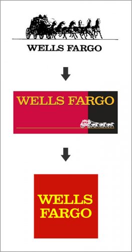
Take Wells Fargo, for example. Wells Fargo started as primarily a financial courier services company but has slowly evolved into primarily a banking and financial institution. While they still use the iconic stagecoach to represent their long and storied history in marketing collateral and advertising, it has been phased out of their logo.
Things to remember when refreshing your logo
You’ve established that your logo is dated, and busy; it doesn’t represent the evolution of your company, or perhaps all three – it’s time for a refresh. Keep these guidelines in mind during your logo refresh project.
Trendy designs will age more quickly
When you go through the process of redesigning your logo, you or others involved may be tempted to design something that is really stylish or super trendy. Don’t do this; you will regret it when you find yourself back at the drawing board with a dated logo again in just a few short years.
Let’s return to the fashion analogy for just a moment. When thinking about the design of your logo, you want to create a simple black dress or a pair of blue jeans. These items are versatile, never go out of style, and only require minimal updates to be brought up to date. These are the traits that you want to cultivate in your logo.
Consider your logo usage
Designing a logo today may be more difficult than ever, given the sheer number of mediums, both online and offline, in which your logo will be used. Ensure that you consider and share with your designers all the ways you plan to use your logo.
You can assume that you will use your logo on various digital applications, like your website and social media, but be sure that you consider other applications like outdoor advertising, promotional products, print collateral, signage, and/or car wraps.
Identify and keep key features
Ensure that you begin the logo refresh project by identifying the features of your logo that are key to your brand recognition. Maintaining and growing your brand awareness and brand preference needs to be top of mind during your refresh process.
Work with your designers to simplify and modernize your current brand without completely losing elements of the logo that people associate with the brand.
It’s not an art project
Don’t get carried away with your logo refresh project. It’s not an art project and should not be treated as such. Yes, there is a strong artistic element involved in logo design best practices, but your logo is a functional tool in your marketing toolbox and should be designed in such a way.
Avoid trying to make your logo cool. Instead, focus on creating an effective graphic representation of your business. If you have accurately captured your business, then your logo should be appealing to your target audience. When in doubt, stick with the mantra “clear, not clever.”
The Take-Away
Assessing the effectiveness of your brand should be something that you regularly do, with special attention given to the design aspect of your brand at least every few years.
If you are honest with yourself and approach the subject as objectively as possible, you will know if it is time for you to refresh your logo.
If you still aren’t sure if it’s time to refresh your logo, consult a professional logo design agency for a logo consultation.


