When someone first encounters your website, you have a few seconds to convince your visitor they have arrived on a site worth some of their precious time. To make that first positive impression, it almost goes without saying your site must display quickly and navigate easily on a mobile phone, tablet or computer. But just as importantly, it should look good. And how it looks often has a lot to do with how it works.
Visual appeal depends on many factors, including the eye of the beholder. But a website whose style has come and gone will not be visually appealing to most people.
Keeping your site in line with current design concepts and practices, many of which arise from simultaneously improving equipment and software technology, is one thing you must do to create a positive first impression.
Maximizing the initial user experience (UX, as it is often called) is essential in gaining user trust and getting her business. There is another reason to develop awareness of website design: you as the owner or planner should become more able to express how you want your site to look and feel to a designer.
Becoming more familiar with the essential elements of modern design will be helpful. Our Houston website design experts have poured through several resources to arrive at a list of web design advancements in 2019, and we are not attempting to predict any trends. New websites are already showing these adaptations and innovation in animation, illustration, color, layout, typography, and photography.
State of the Art Web Development in 2019
Non-traditional styles such as asymmetrical layouts appear more frequently as browsers become more able to display them reliably. Here are several aspects of website design with examples showing showcasing their remarkable change in 2019.
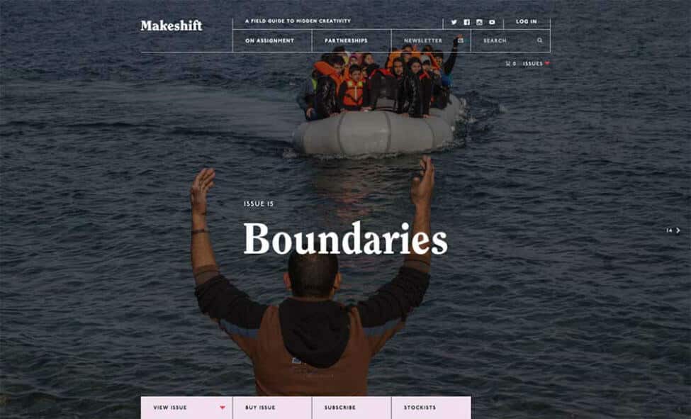
Photography
Photography remains a primary communication element, and the kinds of photography in use today have evolved far beyond pictures of stock photo models in dated attire and hairstyles.
As we, gratefully, see less of that, we see more and more images showing people of color and varying ethnicities, background, and cultures, along with the use of color and effects to match brand to image.
The ever-expanding width of desktop monitors almost requires websites to deploy attention-grabbing images along with well-designed typography. The value of original, high-quality photography continues to become increasingly apparent in sites across all industries.
Video
The use of video on the web has dramatically increased in recent years, and will only continue to grow going forward. Video is now often found beyond the home page to better showcase product capabilities, amplify a message, or show product use scenarios and training.
All modern browsers have built-in video playing capability, which has contributed to this proliferation, along with powerhouse video websites such as YouTube, Vimeo, and others making it a snap to display their public videos on other websites, which can be a boon to your website metrics.
Typography Forward
While not brand new, the variety of font and typography for the web exploded thanks to a BIG BANG of improvements in browser technology along with thousands of font faces made available by Google, Adobe, and many others, that load independently of the user’s computer.
Type once confined to use in rendered images (invisible to search engines) now displays reliably as real, searchable text. Designers have responded by putting typography front and center in all the text areas of a website, with big and bold letters, expressive and varied font and use of display type.
It can’t be stressed enough how important typography is to communicate your unique message and voice. Typography leads the user’s eye, organizes content, improves scanning, and keeps them reading: all important to good UX.
Shadows and Other Gradients
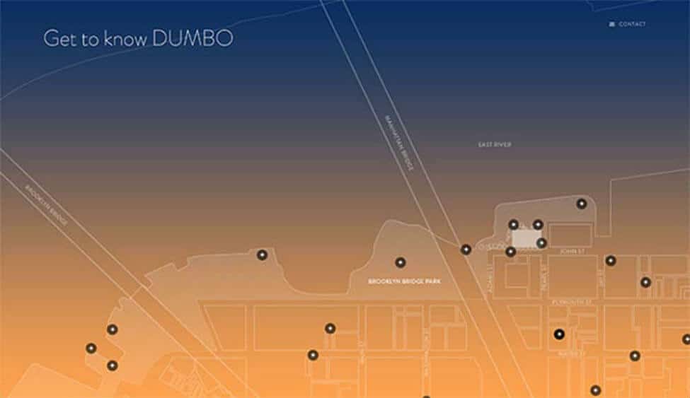
Also not new, the drop shadow makes a come back. Sidelined for years by the dominant “flat” design aesthetic, its use in aiding usability returns, largely because drop shadows and gradients can now be rendered and animated easily with CSS and JavaScript.
And, big, bold, beautiful gradients are more faithfully rendered with modern browsers and mobile devices. All that means is a button can look and behave like a button without downloading several variations of a single image.
And, a page can explode with gradient color without “banding”, i.e., the visual distortion caused by screens that can’t display the required colors or because the image itself was reduced to save bandwidth.
This is crucial because the additional downloads, or server requests, needed for button states and large images now negatively impact the evaluation your website receives from search engines, especially on mobile devices.
Also, it matters because the human eye uses gradients in color and light to interpret distance and isolate objects in space. Shadows and gradients create a more dimensional space which, if used with care, both helps and intrigues the viewer.
An amazing site that uses gradients programmed to change colors depending on the time of day. https://onejohnst.com/
Particle Backgrounds and Other Animations
Large animated images are an especially exciting arena in modern web development. As the use of resource hogging technology once required to display animated graphics has declined, technology has developed to provide animation without killing your processor or stalling page loads.
A text-only script can render a screen filled with animation that both engages and informs. Animation, on both your website and your social media pages, communicates your message effectively, briefly and entertainingly. Click this image to see it come to life:
Custom Illustration
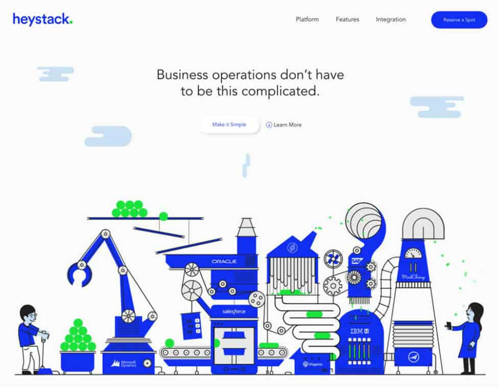
Hand in hand with animation is custom illustration. 2017, 2018, and 2019 saw an increase in websites displaying non-photographic imagery in all kinds of ways.
Custom illustration is both useful to elucidate factual information about products and systems, as well as delight the user with color and flair.
A custom illustration can be directly tailored or easily modified to match guidelines required by those creating a brand name for business, whereas photography by its nature is often less specific and can sometimes be extremely expensive or difficult to acquire.
Asymmetrical Layouts
Because browsers have become more flexible in how a page is finally rendered to the user, websites have begun to abandon the box.
A web page can have elements appear outside the visible or invisible grid boundaries that structure most pages, sometimes called “broken grid layouts,” and then pop back to neatly stacked boxes if that’s better for the rendering device, such as a tall and narrow phone screen. So, designers, no longer dependent on the rectangle, are exploring eye-catching and unexpected layouts.
Asymmetrical design is not always the appropriate way to communicate a message, depending on the nature of the business, or the amount of content, but this trend is making its way among brands who seek to set themselves apart from the competition.
The Take-Away of Modern Web Design
There are many other aspects of website design currently shaping what we see and experience every day on the web. When you look at your current website you may find that you are on the forefront of the latest and greatest trends shaping the web right now, or you may find that your website could use a refresh.
Whether you’re looking to refresh your current website or ensure that a new project features current trends in web design, make sure that you don’t lose sight of you website usability goals along the way.
As you look towards your next web project, the best advice that can be offered is to work with a reputable web design company, or even a specialty WordPress web design firm to ensure that you aren’t lagging behind the mark straight out of the gates and that your website is focused on both form and function. After all, your website isn’t just a vanity piece, it’s an important piece of your marketing mix that serves an extremely important function.


