When creating an effective business website, one of the most important elements to think about is the first thing your potential clients will see – the homepage!
Your website’s homepage is often the first thing your potential customers will see.
4 Questions Your Website Homepage Needs to Address
In his book Don’t Make Me Think, User Experience (UX) expert Steve Krug highlights the four questions that he asks when evaluating website homepage contents.
- “What is this?”
- “What can I do here?”
- “What do they have here?”
- “Why should I be here – and not somewhere else?”
These questions seem pretty obscure and open-ended, but you can address them using homepage content sections that align with your overall marketing strategy.
Learn about five of the most important things to include on your homepage to turn visitors into customers and advocates for your brand.
5 Website Homepage Content Sections to Include
You only get one first impression. Make sure your homepage content comes off as polished and professional while creating an online presence for your business.
1. An Effective Hero Message
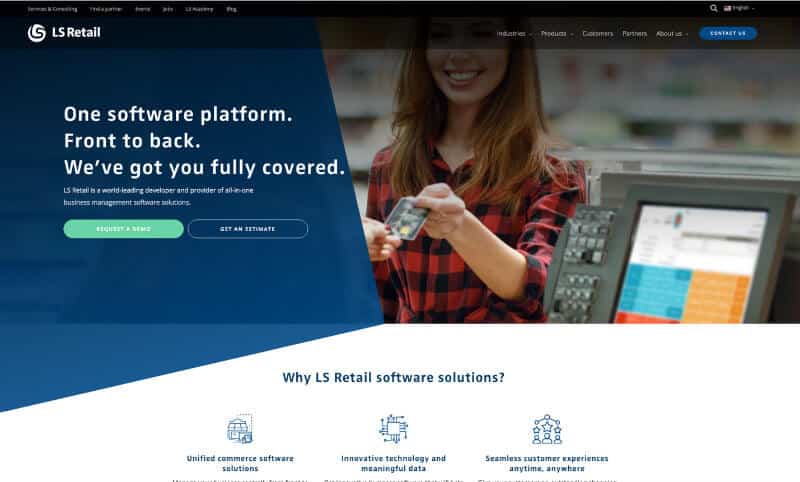
Dumping a whole mess of text and out-of-context images onto your homepage does nothing for visitors. Instead, have an eye-catching hero image that instantly tells them what you do and/or what you offer. A concise hero image and message is one of the most frequently recommended components in B2B website examples.
Take some extra time to craft the perfect, clear headline focused on all the benefits you can bring to the table. Make sure you include a call-to-action at the end to get them started with your product or services.
2. Easy Navigation
After visitors are hooked, the next step is providing them with a smooth experience when navigating your website. Make sure that each category is clearly titled and organized- disoriented visitors will quickly leave if your website is not intuitive. The goal is to not make them “hunt” for anything- instead, you should focus on providing all the information they seek and more.
One important improvement to your navigation is making every navigation element clickable. Add an arrow to indicate drop-down menus and differentiate them from direct links. This ensures that people clicking on subcategories can find more pages pertaining to what they’re looking for.
Keep in mind that an important element of the menu items found on your homepage is being able to tell which one is active once they start exploring. A cleanly-designed top navigation uses hierarchies and color differentiation to make it obvious where they are located within your site. For example, using breadcrumbs or styling the menu link that is currently active within the top nav to have a different color and background can help users determine exactly where they are.
Don’t forget to make sure that clicking the logo takes them back to the home page. Users have come to expect this as standard practice, and good web design companies will know to implement a clickable logo.
It can be difficult to predict user behavior or what they’re looking for but brainstorming and testing different content hierarchies and sections of a website homepage can make a big difference. You can use tools like heatmaps to see which format works better over time.
3. Overview of Services or Products
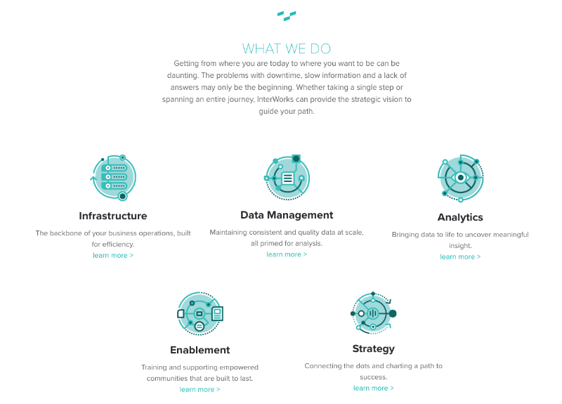
When people come to your website, one of the primary things they are looking for is what you offer. You want to easily display your services or products offered so they can immediately see the different options. If someone is looking for what makes your company special compared to your competitors, they’ll want to leave if the message is muddled and hidden.
One of the best ways to avoid that scenario is to have simple visual representations with a sentence or two accompanying each one to summarize or elaborate each service. Keep the message direct and clear so that potential clients can zero in on what they want from you as fast as possible!
4. Social Proof and Success indicators
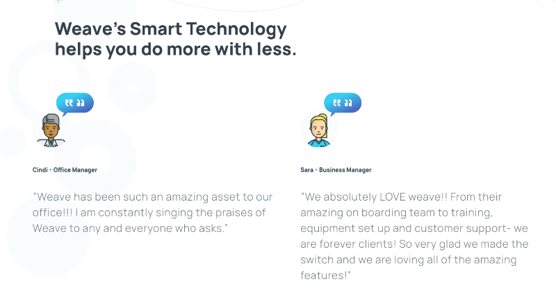
People want to know they can trust your company. Luckily there are several ways to earn this trust. One idea for what content should be on a homepage is social proof. In marketing, social proof is a method of using third parties to influence potential customers.
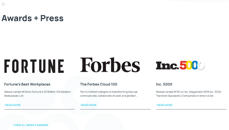
Social proof can come in many different forms. Anything that is evidence of your success is a good way to indicate your trustworthiness. For example: customer testimonials, a board of client logos or businesses you’ve partnered with, awards you’ve received, case studies, press mentions, positive statistics, etc.
The more examples you can provide of your company’s skill and superior performance, the more people will want to work with you.
You can start building social proof by learning how to get Google reviews for your business.
5. An Organized Footer
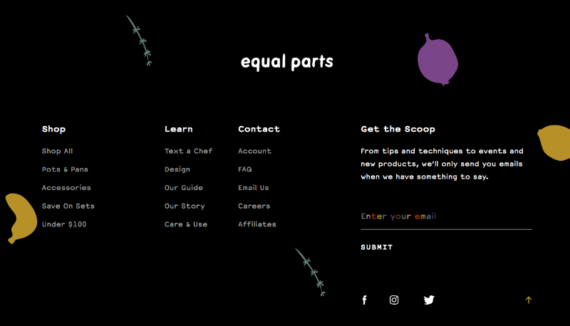
A footer is an underrated element of a website homepage. A good footer grounds a website by offering an organized view of the most important links on your entire website and useful external links such as social media profiles or partner websites.
If someone is having trouble locating something, they will often scroll to the bottom of the webpage looking for the footer as a guide.
One of the most important things you can do is include a contact page or even a way to sign up for your newsletter. Making sure customers can easily find contact information or frequently asked questions can help convert visitors into leads.
Let MARION Help You Design Your Homepage
If you’re struggling to decide what content should be on a homepage, a custom website design company like MARION can help! Our SEO, content, and web design specialists come up with a straightforward plan to implement the best website homepage content ideas or your brand.
Contact us online today to schedule a free consultation!


